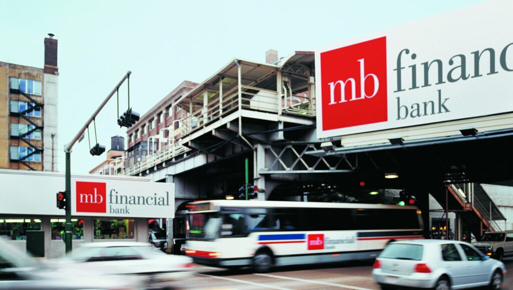
In 1998, a young, ambitious executive took over a ninety-year old Chicago bank. His plan was to merge his bank with another ninety-year old bank of equal size. To complete the merger, the bank needed a new name, identity and brand strategy. The bank’s marketing director set up a meeting and the bank’s president agreed to allow me to lead the brand initiative. Neither the president nor the marketing director knew where to turn, and the design “bar” was low. Their need to complete the brand project in short order on a small budget, coupled with my reputation working with other banks and financial firms made me a safe bet.
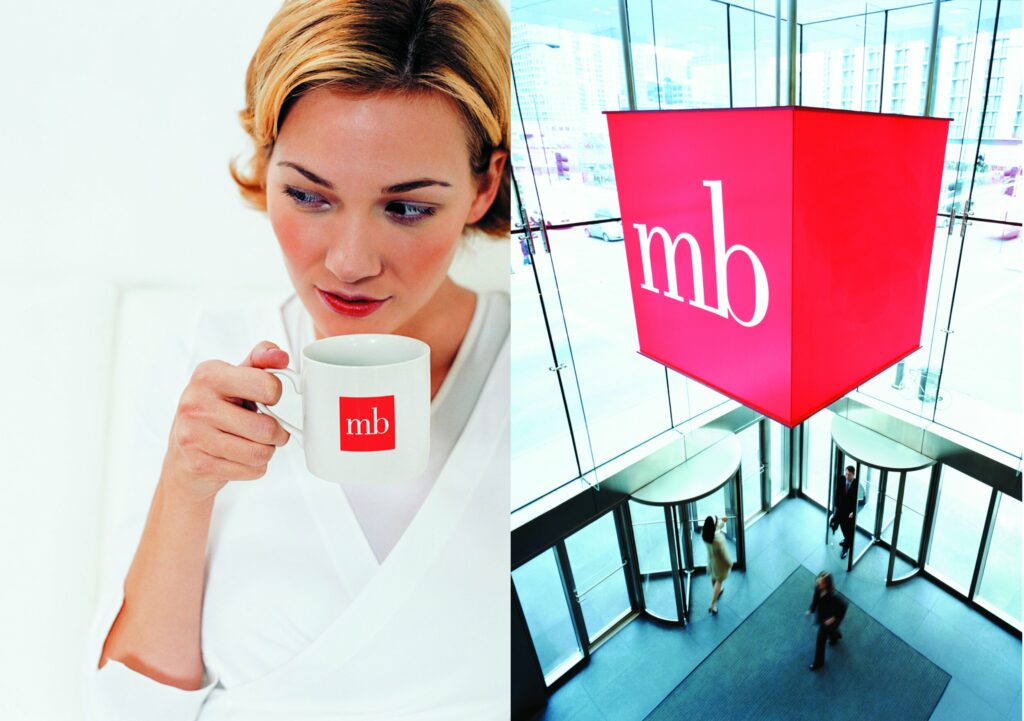
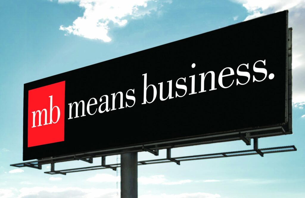
Since neither bank knew anything about design, branding or marketing, they had little choice but to trust my expertise, allowing me to work freely and efficiently. The new name, “MB Financial Bank” was derived from the same initials (mb) shared by the two merged banks: Manufacturers Bank and Mid City Bank. Knowing that a distinguishing mark was essential to the bank’s success, I pushed the management team to think differently about banking. The bank’s new logo was designed with the initials “mb” set in lowercase Bodoni, contained within a red square. The square was selected because of its simplicity and the color red was selected because of its power. Because of its iconic quality, the MB logo soon became the bank’s greatest asset. When a brand awareness study was done eighteen months after its brand launch, MB had 87% of the brand awareness of the leading local bank which was established thirty years prior, had branch banks throughout Chicago, and a marketing budget that was six to seven times larger than MB’s.