

News and Insights
Designing for Good / Designing for (Very) Bad
Designing for Good
Complicity of the design profession with big business has contributed to the expansion and globalization of commercial culture, leading many designers to question the ethics of their work. For too long design has been used to induce the devoted world to buy more products than it needs while developing countries lack the basic necessities of life. To make matters worse, these superfluous products are often made in sweatshops by the most deprived people of our world, yet all too often designers help companies gloss over such brand-depreciating details.
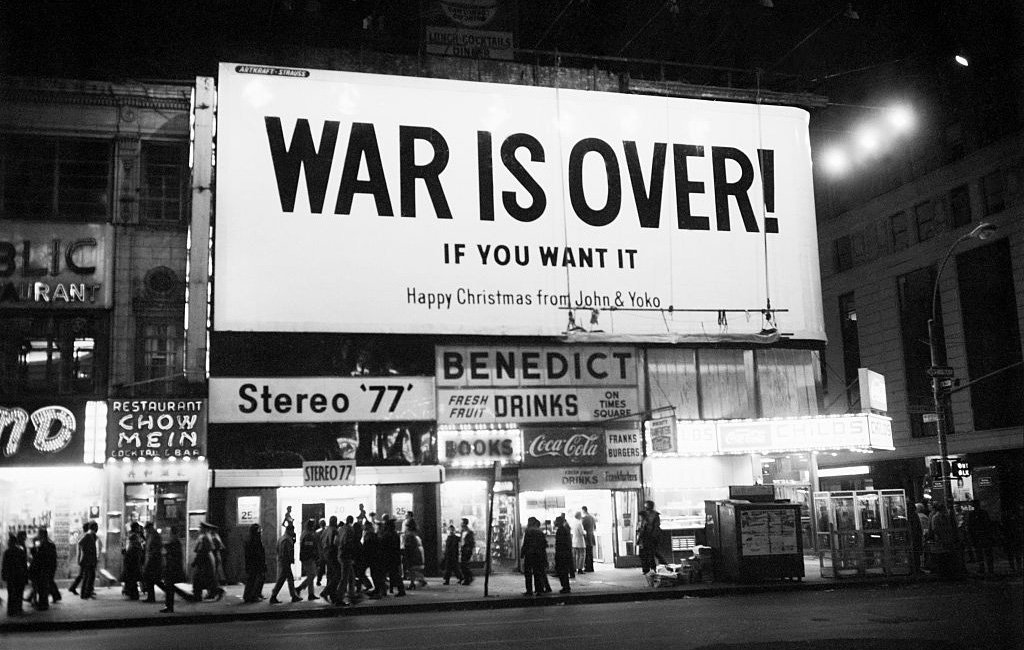
Christmas Card from John Lennon and Yoko Ono
Designers have the unique ability to respond to the needs of clients and to those of society. The persuasive power of design can radically alter the way people think about issues, about products, about others, and about themselves. While not all work done by designers falls within the realm of ethical decision-making, designers need to tip the balance from the commercial to the social to remain a relevant and vital cultural force.
Graphic design has certainly been a profession ongoing rapid change, but like all design disciplines, it is also a part of broadening global crisis. We have historically designed for the future seeking to obtain more pleasure, power, comfort, efficiency and profit. This time around, we should design with attention to the past. We must counter a legacy of design that left us with too much clutter, misinformation and waste. Over the past few decades, we have learned to adapt to increasing complexity. Its time for designers to return to a more human condition – slowing the pace, embracing simplicity. Innovative design should not be defined by novelty or profitability, but by sustainability.
Designing for (Very) Bad
Design, good or bad, is a vehicle of memory. Good design adds value of some kind, gives meaningful, context to an idea or message, and not incidentally, can be sheer pleasure to behold. It reflects the receiver’s sensibilities and rewards the entrepreneur. It is easier to remember something that is well-designed than one that is modeled.
A well-designed logo is a reflection of the organization that it represents. When used for good, it connotes a thoughtful and purposeful enterprise, and mirrors the quality of its culture products, and/or services. It is good public relations, a harbinger of good will. It says, “we care.” On the flip side, a well designed logo can connote something good when in fact it is something very bad.
From time-to-time, I’m asked to define good design and to give examples. On one occasion I was asked, “what’s the perfect design?, and I responded, “the paper clip.” The paper clip was designed centuries ago for the purpose of holding paper together. It’s not clear who designed it, but its perfect: beautiful, simple and economical. The ultimate blend of form and function. Today, there are many versions of the paper clip, but none of them surpass the original, made from a single strand of looped wire.

I was asked on another occasion, “what is an example of a great logo?” The person who asked the question was a good friend, and Jewish. With great trepidation, my response to her was, “you’re not going to like my answer – the swastika.” And of course, she said, “you’re right. I don’t like your answer.” I went on to explain that I first saw the swastika in Nazi propaganda films when I was in high school. I had never seen anything like it before—a bold, black symmetrical shape contained within a white circle and a perfectly proportioned field of red. The swastika was the first modern logo, unlike any other graphic symbol of its time. Ironically, the Nazi swastika that today symbolizes some of the most horrific events of human history – the Holocaust, global mass destruction, and death – is based on an ancient Asian symbol of prosperity, harmony and happiness. I went on to say that despite what it represents, the swastika looks modern in the twenty-first century, which makes it a great logo. I’m not sure if my friend appreciated my rational, but to her credit, we remain friends today.
To get a full copy of “Pencil to Mouse, Forty Years of Graphic Design” by Kerry Grady, follow the link https://www.gradycampbell.com/gci-store/from-pencil-to-mouse