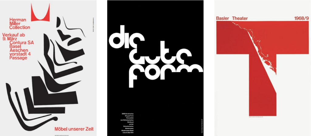
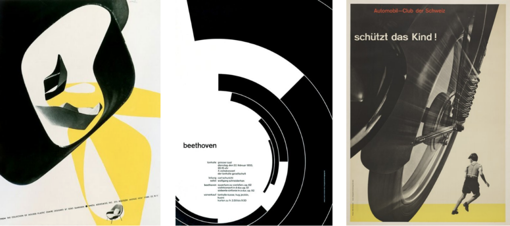
My approach to graphic design is influenced most by the Swiss Style designers Emil Ruder, Armin Hofmann, and Josef Müller-Brockmann. The Swiss Style, also known as the International Typographic Style, was developed in Switzerland in the 1950s. This style was defined by the use of sans-serif typefaces and page grid structures, producing asymmetrical layouts. By the 1960s, the grid had become a standard practice and came to reflect the style and methods of Swiss graphic design. The Swiss style emphasized the combination of typography and photography as a means of visual communication. Swiss designers were best known for their posters, which were seen to be the most effective means of communication of that period. The Swiss style influenced a generation of graphic designers in Western Europe and the United States. I’m one of them.
Emil Ruder was a Swiss typographer and graphic designer who lead the faculty at the Schule für Gestaltung Basel (Basel School of Design). He is distinguishable in the field of typography for developing a holistic approach to designing and teaching that consisted of philosophy, theory and a systematic, practical methodology. He expressed lofty aspirations for graphic design, writing that part of its function was to promote “the good and the beautiful in word and image and to open the way to the arts”. He was one of the major contributors to Swiss Style design and taught that typography’s purpose was to communicate ideas through writing, as well as placing a heavy importance on sans-serif typefaces. No other designer since Jan Tschichold was as committed as Ruder to the discipline of letterpress typography or wrote about it with such conviction.

Armin Hofmann began his career in 1947 as a teacher at the Allgemeine Gewerbeschule Basel School of Art and Crafts at the age of twenty-six. Hofmann followed Emil Ruder as head of the graphic design department at the Schule für Gestaltung Basel and was instrumental in developing the Swiss Style. His teaching methods were unorthodox and broad based, setting new standards that became widely known in design education institutions throughout the world. Hofmann’s insights as an educator, combined with his rich and innovative powers of visual expression, created a body of work enormously varied – books, exhibitions, stage sets, logotypes, symbols, typography, posters, sign systems, and environmental graphics. His work is recognized for its reliance on the fundamental elements of graphic form – point, line, and shape – while subtly conveying simplicity, complexity, representation, and abstraction. He was also an influential educator, retiring in 1987. In 1965 Hofmann wrote the “Graphic Design Manual”, a popular textbook in the field. Armin Hofmann is well known for his posters, which emphasized economical use of color and fonts, in reaction to what he regarded as the “trivialization of color.” His posters have been widely exhibited as works of art in major galleries, including the New York Museum of Modern Art. One of his posters, designed in 1954, hangs in my home office.
In 1990, I hosted an exhibit of Armin Hofmann’s work in Chicago and invited him to attend the opening. While he thanked me for the invitation, he said that his schedule was full and he may not make it to the opening. His wife then got on the call and explained that he was afraid of flying. She went on to say that he had just returned from a trip to New York a few weeks earlier and was still traumatized by the experience. Instead, he sent a letter of gratitude and encouragement that left a lasting impression on me. Armin Hoffmann was a gentle spirit, a loving husband and father, and the kind of designer that I want to be modest, diligent, and kind.
Josef Müller-Brockmann studied architecture, design and history of art at both the University and Kunstgewerbeschule Zürich. In 1936 he opened his Zurich studio specializing in graphic design, exhibition design and photography. He designed concert posters for the Tonhalle in Zurich. In 1958 he became a founding editor of “ New Graphic Design” along with R.P. Lohse, C. Vivarelli, and H. Neuburg. In 1966 he was appointed European design consultant to IBM. Brockmann is recognized for his simple designs and his clean use of typography (notably the font Akzidenz-Grotesk), geometric shapes and vivid colors which inspire many graphic designers today. Müller-Brockman was author of several books on design and visual communication.

In 1990, I was part of a Chicago design conference sponsored by the American Institute of Graphic Arts. At one point, I was not particularly interested in the speaker, so I left the conference theater and moved into a small room where there was a design exhibit. There was one other person in that room and I recognized him. It was Josef Müller-Brockmann, just as I had imagined—small in stature, wearing a tweed jacket, thoughtfully examining the work that was on display. I somehow found the courage to walk up to him and introduce myself. I don’t recall precisely, but I probably said something about how much he influenced me. He seemed to welcome the company and invited me for a drink.
There we sat, for almost two hours. He did most of the talking, telling me the story of how he stumbled into graphic design as a failed painter, that his wife was actually the more talented one, that by saying “no” to the opportunities that might be financially advantageous but conflict with our values ultimately lead to even greater opportunities that we can feel good about, and that the grid was just a logical step in trying to provide structure to a page. At the end, the one thing he said that he wanted me to remember most of all, was “clear thinking”. I believe that thinking clearly to him, meant that in the midst of changing views, cultural shifts and technological disruption, its important to step back and to remember what is essential to good design.
